
New Year, New Website
Web technologies are constantly evolving, day in and day out. Much of our responsibility as web and product designers is to continue learning and keep up with the pace of innovation in order to deliver the best possible experiences for our users. The learning never stops, and that's what makes our work so awesome and exciting.
With this in mind, I try to use my side projects like this website as a continual experiment and testing ground for experiential learning and ideating on new designs, frameworks, and methodologies.
This year, I willingly jumped on the new year, new website bandwagon to redesign my personal blog from the ground up. It was about time, and I'm happy I took the leap.
Not only did this exercise offer me the opportunity to improve the look and feel with a fresh new interface, but it gave me an excuse to explore new CSS and Javascript frameworks, the knowledge from which I can apply to other areas of my work (like our awesome new product updates coming to Veritonic).
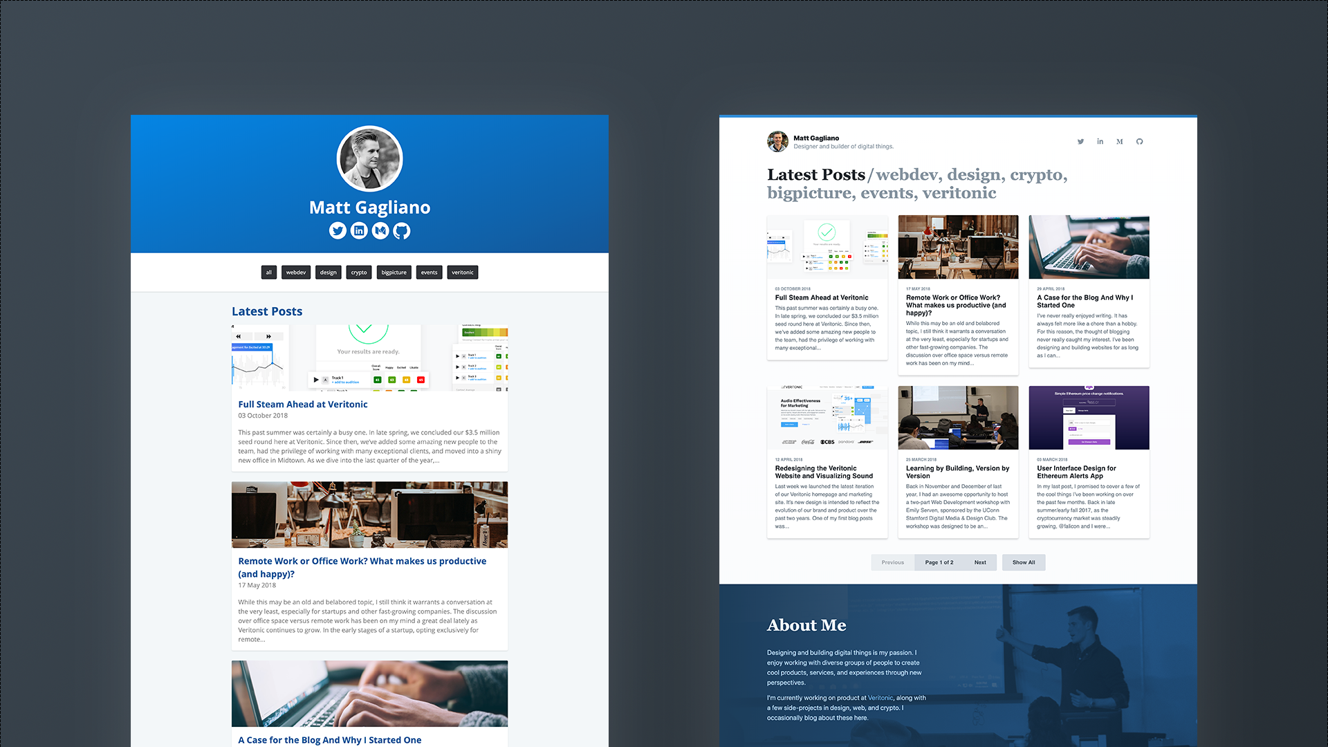
One of my main goals for this redesign was to bring more content above the fold. On most screens, the main header of the old website would take up about 80% of the view height. Since posts were stacked vertically, the remaining 20% would be occupied by only the top half of the first post's feature image.
This meant that visitors landing on the page for the first time effectively didn't see any content.
To correct for this, I reduced the height of the header and created rows and columns of three posts across to fill the bottom 60% of the view height above the fold.
Now, non-mobile visitors can see the feature images, titles, and previews of the latest three posts and engage with them before having to scroll.
I also updated the navigation style with a new design that combines navigation, tags, page titles, and breadcrumbs into a single component.
On the home page (or Latest Posts page), the links after the slash mark are dynamically populated with post tags. Clicking into a tag filters the posts by that tag.
On post level pages, the post title is displayed after the slash, and the Latest Posts link stays persistent for easy access back to the home page.
Using TailwindCSS, a new utility-based CSS framework, I was able to build the entire site with less than 50 lines of custom unminified CSS.
With utility classes, TailwindCSS allows for easy rapid prototyping and nearly infinite customization, meaning there's no need to have to constantly override classes like you would when using Bootstrap.
For example, the pill-style tag buttons at the top of this page would be styled like this with vanilla HTML and CSS:
<style>
  .tag {
    display: inline-block;
    background-color: #dae1e7;
    border-radius: 9999px;
    font-weight: 600;
    margin-right: .5rem;
    padding: .25rem .75rem;
    color: #3d4852;
    font-size: .875rem;
    text-decoration: none;
  }
  .tag:hover {
    background-color: #b8c2cc;
  }
</style>

<a href="/tags/design/" class="tag">design</a>
With Tailwind, those styles can be easily condensed into a set of utility classes, producing the same result as the code above:
<a href="/tags/design/" class="inline-block bg-gray-400 hover:bg-gray-500 rounded-full px-3 py-1 text-sm font-semibold text-gray-800 mr-2 no-underline">design</a>
This makes it easy to prototype ideas without spending time writing new CSS. And when you start to reuse similar patterns, Tailwind allows for building custom components from existing utility classes using the @apply directive:
<style>
  .tag {
    @apply inline-block bg-gray-400 hover:bg-gray-500 rounded-full px-3 py-1 text-sm font-semibold text-gray-800 mr-2 no-underline;
  }
</style>

<a href="/tags/design/" class="tag">design</a>
I stumbled upon Tailwind on Twitter through @adamwathan and @steveschoger, who are among the creators of the framework. I had been following the project for about a year prior but had not really explored it until now.
It's available via CDN, but installing and configuring Tailwind with npm opens up even more possibilities for customization and tailoring for your specific project (like the @apply example above). It's a framework that I will most definitely use again, and I'm exploring ways to bring it into our design system at Veritonic.
Under the hood, this site is still running on Jekyll. I've found that it's still the simplest and cleanest way to run a static site or blog, and it beats Wordpress by a long shot.
That being said, I did look into potentially moving over to GatsbyJS, a static site generator like Jekyll that's built on React.
It has a few more features that I'd eventually like to see on this site, including out-of-the-box support for Progressive Web App techniques.
This website is my place for experimenting, and rebuilding this site on GatsbyJS would be a fun way to learn and experiment with React.
But that's a project for another day.