
Rebuilding My Website and Learning Next.js
In the midst of uncertainty about the future of many of our favorite social platforms, running a personal website where you control the code and content is more important than ever. It can be the foundational layer of a personal brand or online presence, and it's a great place to experiment with new tools and technologies in a space that's all your own.
After neglecting my blog for years, I'm excited to revive it with a newfound dedication to more regular publishing. But why stop there? I also decided to take on the challenge of rebuilding my website, using this opportunity to learn new skills and frameworks, and share my experience along the way.
The Old Site
My previous website was built with Gatsby, a static site generator built on top of React. I chose Gatsby because I wanted to get some exposure to React, and it seemed like a great way to get started. I also wanted to build a site that was fast and easy to maintain, and Gatsby delivered on both fronts.
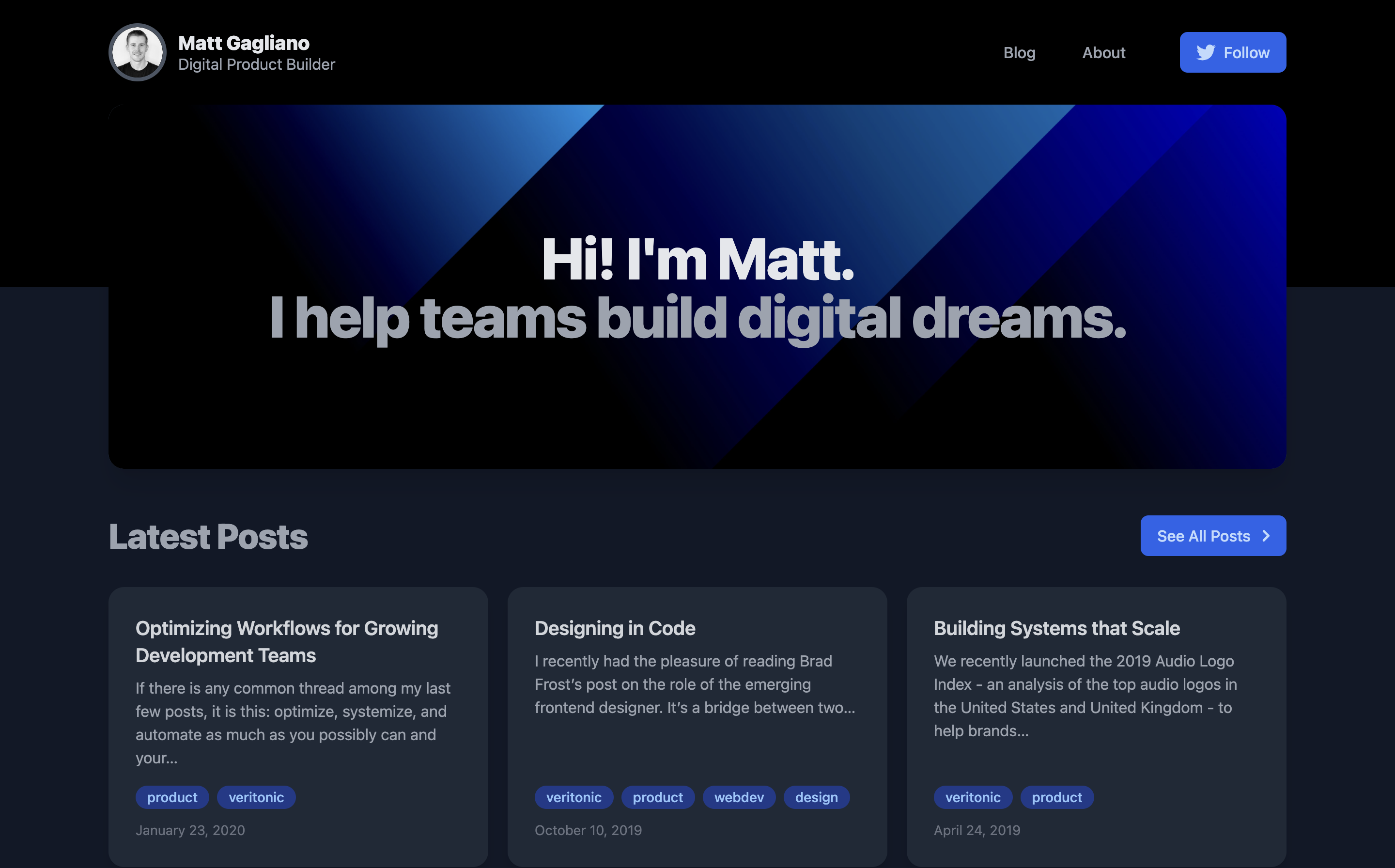
But as the React ecosystem evolved, I decided it was time for a rebuild to learn a new framework and leverage that knowledge across my other projects.
The New Stack
I decided to use Next.js, a React framework for building static and server-rendered applications that has had seemingly exponential growth in popularity. Having built my previous website in Gatsby, this was a great opportunity to extend my knowledge of React and learn a more powerful framework.
To get the most out of Next.js, I hosted the site on Vercel, a platform for deploying static sites and serverless functions as well as the creators of the Next.js framework.
I also used Tailwind CSS for styling, as I've been really impressed with its flexibility and ease of use in other projects.
Design and Architecture
To help kickstart the project and beat coder's block, I started with a template from Tailwind UI, a collection of beautiful, ready-to-use components built by the creators of Tailwind CSS. I chose the Spotlight template, which was a great starting point for a personal website or blog. Since it was written in Next.js, it helped me get a feel for the framework and how it works, along with best practices for structuring a Next.js application and working with components.
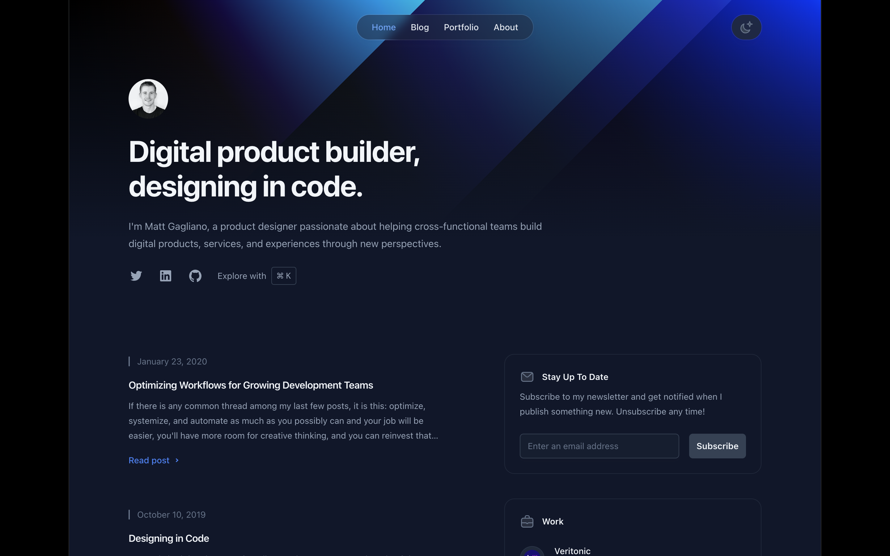
After configuring the app and setting up the basic structure, including installing a sitemap using next-sitemap and removing placeholder content, I customized the overall design to reflect my personal brand.
One of the main things I wanted to keep was the signature cascading gradient background which I use across my social media profiles and old website. I was able to achieve this effect in the header by using a linear-gradient background on a new div element in the _app.jsx file, wrapped around a transparent gradient overlay to fade into the page background.
.hero-dark {
  background: radial-gradient(100% 225% at 100% 0%, #FF0000 0%, #000000 100%), linear-gradient(236deg, #00C2FF 0%, #000000 100%), linear-gradient(135deg, #CDFFEB 0%, #CDFFEB 36%, #009F9D 36%, #009F9D 60%, #07456F 60%, #07456F 67%, #0F0A3C 67%, #0F0A3C 100%);
  background-blend-mode: overlay, hard-light, normal;
}
.hero-dark-overlay {
  background: linear-gradient(180deg, rgba(255, 255, 255, 0) 0%, #0f172a 100%);
}
I changed the dark color scheme to use Tailwind's slate palette, which has a slight blue tint that better fits my brand. While Tailwind cautions against swapping out different palettes 1:1, I found that the new palette worked just as well with the existing dark mode design and required minimal adjustment beyond a simple find and replace. I did not need to change the light color scheme.
Another design element I improved was the framing and positioning of images. The original template had a slight skew to the images throughout the site that made it a bit more whimsical. My brand is just... not that. To fit my style, I added a glass-style frame to the standalone image on the About page.
To achieve the glass-style frame, I reused similar styles from the navigation bar and applied additional backdrop-blur and padding. The resulting code looks like this:
<div className="rounded-2xl p-6 bg-white/50 text-sm font-medium text-slate-800 shadow-lg shadow-slate-800/5 ring-1 ring-slate-900/5 backdrop-blur dark:bg-slate-800/50 dark:text-slate-200 dark:ring-white/10">
  <Image
    src={portraitImage}
    alt="Matt Gagliano"
    sizes="(min-width: 1024px) 32rem, 20rem"
    className="aspect-square rounded-lg object-cover"
    priority
    placeholder="blur"
  />
</div>
Since the image on the About page is close to the header, it's partially floating above the background gradient. This really accentuates the glass effect around the image.
Highlights
Many apps today incorporate a keyboard-navigable command palette to help users quickly find what they're looking for. I wanted to add this functionality to my site, so I started with the app that I believe does this to the best effect: Linear. As it turns out, one of the developers at Linear, Paco Coursey, open sourced the command palette (⌘K) that's used inside the Linear app.
After a few false starts using ⌘K out of the box, I did a bit more research and found that the dialog primitive from Radix can be wrapped around the command palette itself, creating a nice modal overlay effect that's also fully accessible.
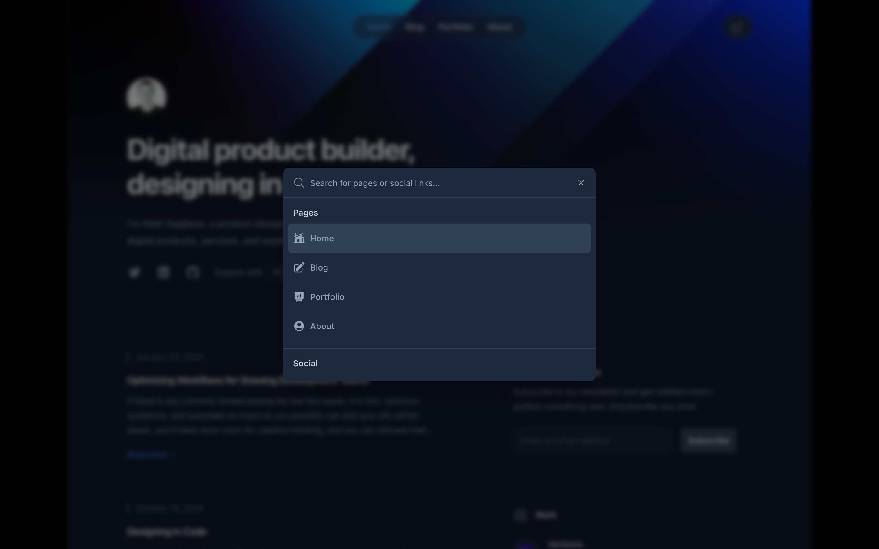
Diving in even deeper, I stumbled across @shadcn on Twitter, who had combined Radix and Tailwind to create an open source repository of ready-to-use react components. The project is not so much a component library as it is a collection of code snippets that can be dropped into your app and customized.
Using Radix, Tailwind, and ⌘K as foundational primitives, @shadcn created a functional command palette that I was able to integrate with minimal effort. I customized the component and icons to fit my brand and added a few additional commands, including links to my social media profiles and a toggle to switch between light and dark mode.
The final component looks like this in TypeScript:
"use client"

import * as React from "react"
import {
  PencilSquareIcon,
  HomeModernIcon,
  PresentationChartBarIcon,
  UserCircleIcon,
} from '@heroicons/react/24/solid'
import {
  SunIcon,
  MoonIcon,
} from '@heroicons/react/24/outline'
import {
  TwitterIcon,
  GitHubIcon,
  LinkedInIcon,
} from '@/components/SocialIcons'
import {
  CommandDialog,
  CommandEmpty,
  CommandGroup,
  CommandInput,
  CommandItem,
  CommandList,
  CommandSeparator,
} from "@/components/ui/command"

function disableTransitionsTemporarily() {
  document.documentElement.classList.add('[&_*]:!transition-none')
  window.setTimeout(() => {
    document.documentElement.classList.remove('[&_*]:!transition-none')
  }, 0)
}

function toggleMode() {
  disableTransitionsTemporarily()

  let darkModeMediaQuery = window.matchMedia('(prefers-color-scheme: dark)')
  let isSystemDarkMode = darkModeMediaQuery.matches
  let isDarkMode = document.documentElement.classList.toggle('dark')

  if (isDarkMode === isSystemDarkMode) {
    delete window.localStorage.isDarkMode
  } else {
    window.localStorage.isDarkMode = isDarkMode
  }
}

export function CommandKDialog() {
  const [open, setOpen] = React.useState(false)

  React.useEffect(() => {
    const down = (e: KeyboardEvent) => {
      if (e.key === "k" && e.metaKey) {
        setOpen((open) => !open)
      }
    }

    document.addEventListener("keydown", down)
    return () => document.removeEventListener("keydown", down)
  }, [])

  return (
    <>
      <CommandDialog open={open} onOpenChange={setOpen}>
        <CommandInput placeholder="Search for pages or social links..." />
        <CommandList>
          <CommandEmpty>No results found.</CommandEmpty>
          <CommandGroup heading="Pages">
            <CommandItem onSelect={() => window.location.assign('/')}>
              <HomeModernIcon className="mr-2 h-4 w-4" />
              <span>Home</span>
            </CommandItem>
            <CommandItem onSelect={() => window.location.assign('/blog')}>
              <PencilSquareIcon className="mr-2 h-4 w-4" />
              <span>Blog</span>
            </CommandItem>
            <CommandItem onSelect={() => window.location.assign('/portfolio')}>
              <PresentationChartBarIcon className="mr-2 h-4 w-4" />
              <span>Portfolio</span>
            </CommandItem>
            <CommandItem onSelect={() => window.location.assign('/about')}>
              <UserCircleIcon className="mr-2 h-4 w-4" />
              <span>About</span>
            </CommandItem>
          </CommandGroup>
          <CommandSeparator />
          <CommandGroup heading="Social">
            <CommandItem onSelect={() => window.open('https://twitter.com/matttgagliano', '_blank')}>
              <TwitterIcon className="mr-2 h-4 w-4 fill-slate-700 dark:fill-slate-400" />
              <span>Twitter</span>
            </CommandItem>
            <CommandItem onSelect={() => window.open('https://www.linkedin.com/in/matttgagliano/', '_blank')}>
              <LinkedInIcon className="mr-2 h-4 w-4 fill-slate-700 dark:fill-slate-400" />
              <span>LinkedIn</span>
            </CommandItem>
            <CommandItem onSelect={() => window.open('https://github.com/matttgagliano', '_blank')}>
              <GitHubIcon className="mr-2 h-4 w-4 fill-slate-700 dark:fill-slate-400" />
              <span>GitHub</span>
            </CommandItem>
          </CommandGroup>
          <CommandSeparator />
          <CommandGroup heading="Theme">
            <CommandItem onSelect={toggleMode}>
              <SunIcon className="dark:hidden mr-2 h-4 w-4 text-slate-700 dark:text-slate-400" />
              <MoonIcon className="hidden dark:block mr-2 h-4 w-4 text-slate-700 dark:text-slate-400" />
              <span className="dark:hidden">Light</span>
              <span className="hidden dark:block">Dark</span>
            </CommandItem>
          </CommandGroup>
        </CommandList>
      </CommandDialog>
    </>
  )
}
Rounding out the rebuild project, I also connected ConvertKit to the newsletter subscription component and added Success and Thank You pages for double opt-in, which helps to protect against spam.
The newsletter subscribtion and resume components are reused throughout the site, with the resume component being imported on both the Home page and About page, and the newsletter component being imported on the Home page, Blog pages, and Portfolio page. This avoids any code duplication and makes it easier to update the components in the future from a single source of truth.
What's Next
I was really impressed with the developer experience of Next.js and the ease of use of Tailwind, Radix, and the other code examples I referenced. I'm looking forward to using these tools in future projects and continuing to learn more about React.
I'm also planning to eventually refactor the file structure of the site from the current pages structure to take advantage of Next.js's new app directory, which is in beta at the time of this writing and promises to improve nested routing with server side rendering by default.
Until then, I'm happy with the new site and excited to publish more frequently. Stay tuned!