
Redesigning the Veritonic Website and Visualizing Sound
Last week we launched the latest iteration of our Veritonic homepage and marketing site. The new design is intended to reflect the evolution of our brand and product over the past two years.
One of my first blog posts was a short observation on the evolution of company logos every few years or so. For any given company, each logo iteration became clearer and more refined as their product and target market changed (think Starbucks or Apple's logo evolution). As awareness of their brand increased, the logo was adjusted (often subtly) to better reflect and resonate with their audience.
While that post focused primarily on logos, a similar principle still applies to the brand as a whole. It's important to stay current and continue to iterate as your product and customer base grows. And it's crucial to listen to and design for your audience.
Over the past year, our product has evolved considerably. We've improved functionality, added features, and refined user experience based on feedback from our customers.
With a strong product experience, we wanted to ensure our marketing site reflected and highlighted the strengths and benefits of our product in the best possible way.
And so, building a site that communicated our product to our prospective users in a clear, efficient, and enticing way was paramount.
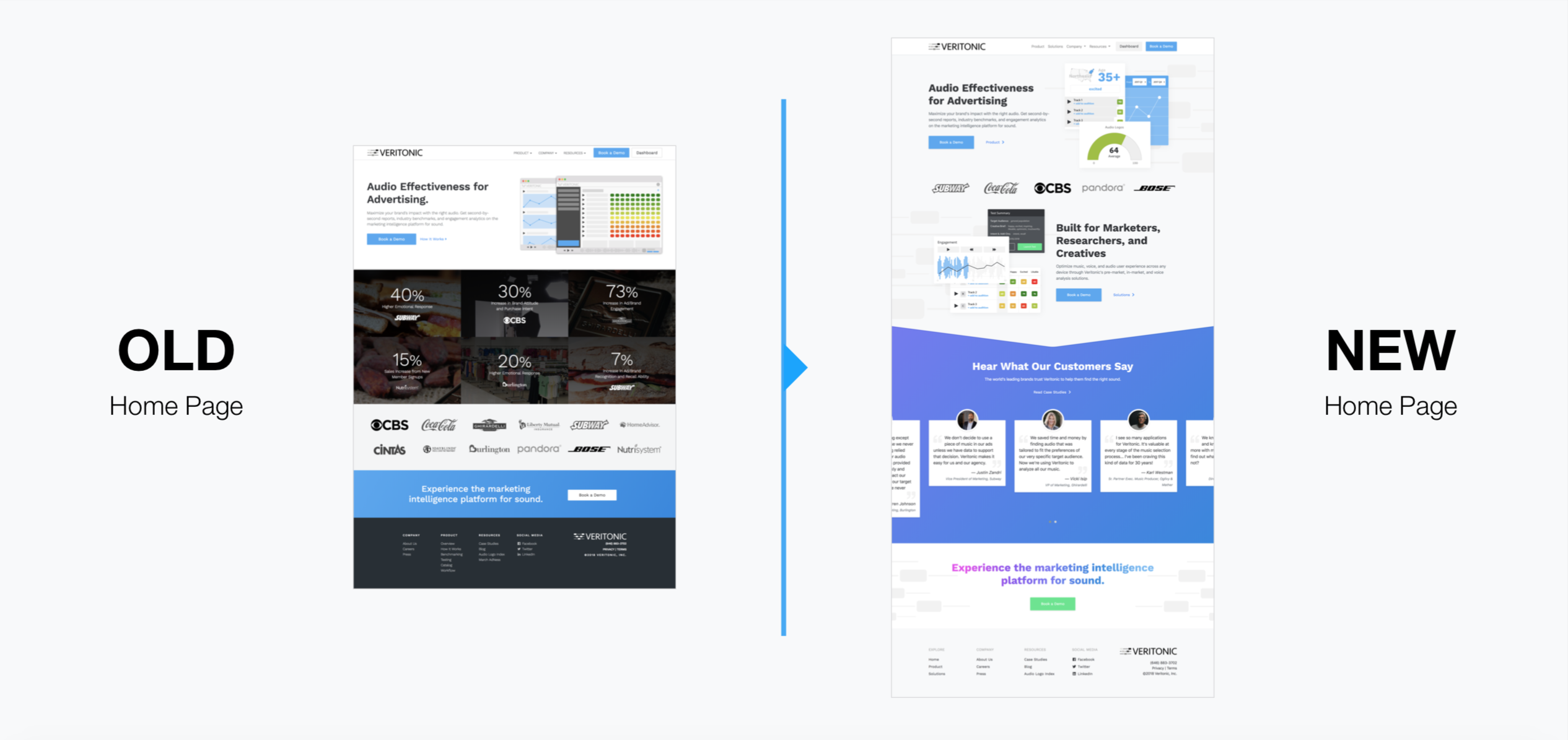
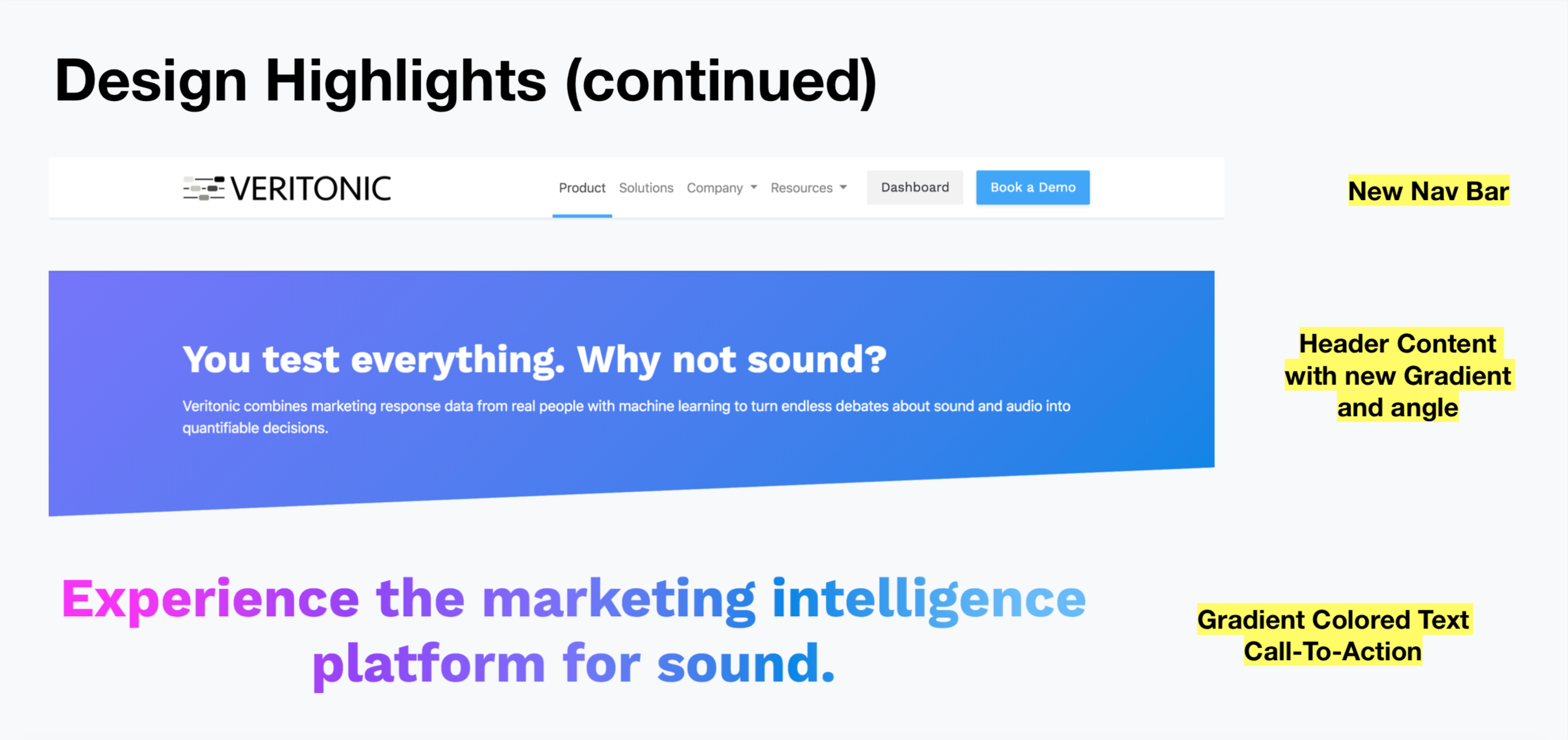
The new design carried over the brand identity and styles from our updated product (fonts, colors, shadows, buttons, cards, etc.) to ensure continuity across our entire experience.
We also updated the content on our Product and Solutions pages to showcase our most important features and the benefits of testing audio effectiveness in both pre-market and in-market spaces across multiple formats.
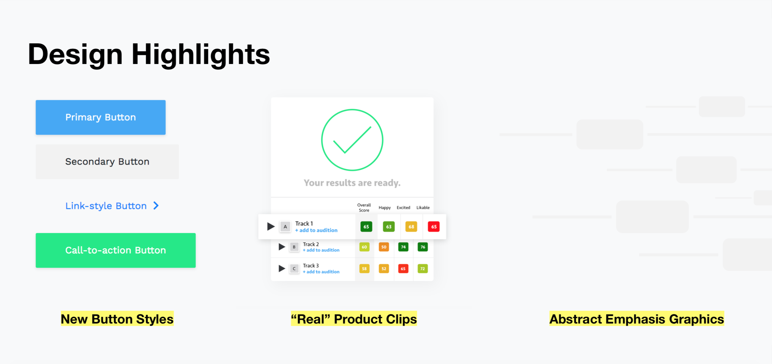
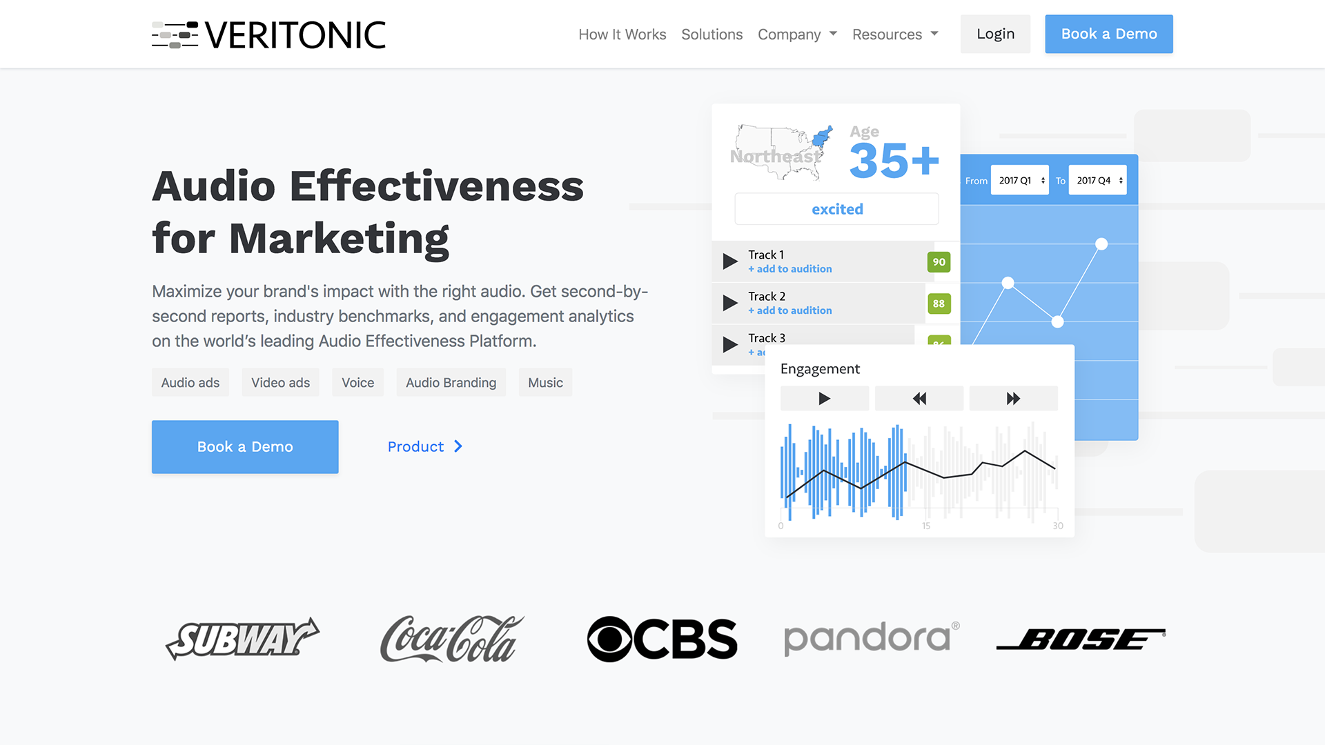
Real product screen-clips played an important role in the new design, bringing the product into almost tangible, tactile form.
In addition, we introduced a recurring, abstract graphic of our logo in the form of large musical staffs with varying depth and opacity in key hero or call-to-action areas. This was intended to help answer a design question earlier on — how do we visualize sound?
The most obvious way to visualize sound is through a waveform, which most audio-focused SaaS applications (including Veritonic) use throughout their platforms. For the marketing site, however, we opted to avoid abstract waveforms altogether (except for use in actual product clips), and instead employed subtle hints at sonic and auditory depth through visual cues.
The abstract Veritonic logo/musical staffs served to do just that, and were complemented with a series of purple to blue diagonal gradients across key background and header areas, as well as an energizing magenta to light blue gradient behind the call-to-action text and above the footer on each page.
With the final redesign now live in the wild at veritonic.com, we're continuing to iterate and refine as we get more insight and feedback from visitors.
This wasn't the first Veritonic redesign, and it definitely won't be the last! But that's the fun in product design — tech ages fast, but the iterative process never gets old.